TL;DR — Boutique hotel mobile traffic is 62–71% of sessions but only 38–49% of bookings. The standard explanation — "the booking engine is broken on mobile" — is wrong on most properties. The actual drop-off is concentrated upstream of the booking engine: photo galleries that don't scale, virtual tours that block first paint, date pickers that occlude imagery, and CTAs buried below content. This post diagnoses the four most common upstream failures and gives you the fixes that closed 80–95% of the mobile conversion gap on the properties we ran them on.
The most common mistake in boutique hotel CRO is assuming the booking engine is at fault for the mobile-vs-desktop conversion gap. The data doesn't support it. Booking engines (Cloudbeds, Mews, SiteMinder, Stayntouch) all have functional mobile experiences in 2026. The gap is upstream — in the property's own pages, before the user even reaches the booking engine.
This post breaks down where mobile users are actually dropping off, and what to fix first.
The Real Mobile Funnel
If you instrument a boutique site with GA4 + Hotjar, the mobile funnel looks roughly like this:
| Step | Sessions | Drop-off |
|---|---|---|
| 1 — Landed on homepage / room page | 1,000 | — |
| 2 — Scrolled past first viewport | 720 | −28% |
| 3 — Engaged with photo gallery / tour | 510 | −29% |
| 4 — Selected a room or expanded rate detail | 280 | −45% |
| 5 — Clicked "Book Now" / opened booking widget | 110 | −61% |
| 6 — Reached booking engine guest-details step | 76 | −31% |
| 7 — Completed booking | 28 | −63% |
Booking engine drop-off (steps 5→7) is roughly 75%. That sounds bad until you compare it to the upstream drop-off (steps 1→5) of 89%. Most properties focus on the booking engine, where there's the least leverage. The gains are upstream.
Diagnosis 1 — Photo Galleries That Don't Scale
Symptom: photo gallery on a 6.1" mobile screen shows photos that are either zoomed too far in (only the duvet visible) or letterboxed with massive black bars top and bottom.
Cause: most boutique websites use photo aspect ratios optimized for desktop (16:9 or 3:2 landscape) and don't crop or swap for mobile. Result: a beautiful 16:9 hero photo of a bedroom looks fine on a 27" monitor and unusable on a phone.
Fix: serve different crops per breakpoint using <picture> element + srcset. For mobile, crop tighter on the bed and remove dead space at the edges. Total work: 2–4 hours for a typical 50-image library.
Diagnosis 2 — Virtual Tours That Block First Paint
Symptom: page loads slowly on cellular, Lighthouse mobile score under 70, LCP over 4 seconds.
Cause: a Matterport iframe added without loading="lazy" initializes the entire 3D engine on first paint. On a 4G connection, that's 1.4–2.6 additional seconds of perceived load time before anything is interactive.
Fix: add loading="lazy" to the iframe. If the tour is above the fold, move it below (see the homepage placement heatmap data). For per-platform implementation:
- Cloudbeds: setup guide — the responsive wrapper there includes
loading="lazy" - Mews: the Distributor placement post includes the lazy-load Distributor toggle
- Other platforms: the PMS comparison covers what each supports
This single fix typically improves LCP by 800ms–1.4s on mobile and recovers the page's eligibility for Google's Core Web Vitals "good" threshold — which feeds Google Hotel Search 3D tour eligibility and organic ranking.
Diagnosis 3 — Date Pickers That Occlude Imagery
Symptom: when a mobile user opens the date picker, the date picker covers the entire viewport, including the photo and rate the user was just looking at. After selecting dates, the user often can't remember what room they were considering.
Cause: most booking widgets default to a fullscreen modal date picker on mobile. This was a sensible default in 2018 when mobile screens were 4.7"; it's a problem on 6.7" screens where there's plenty of room for an inline picker.
Fix: configure your booking widget to use an inline date picker on mobile, not a fullscreen modal. Cloudbeds, Mews, and SiteMinder all support this; the toggle is usually buried in widget appearance settings.
If you can't change the picker (some legacy embeds force fullscreen), the second-best fix is to make sure the room name and rate are persistently visible at the top of the picker overlay so the user maintains context. This is a 30-minute CSS fix on most platforms.
Diagnosis 4 — CTAs Below the Fold
Symptom: on the mobile room-type page, "Book Now" sits below the photo gallery + room description + amenities list. To find it, users have to scroll a third of the way down the page.
Cause: room pages designed mobile-last. The desktop layout has the booking widget in a sidebar (always visible). The mobile layout collapses the sidebar to the bottom of the page (rarely seen).
Fix: a sticky bottom-of-viewport "Book This Room" CTA on mobile, persistent across scroll. Disappears when the user reaches the booking widget or hits the page footer.
This is the single highest-leverage mobile fix on most properties. We've seen direct conversion lifts of +18% to +35% from this change alone, on pages where the rest of the funnel was reasonable.
The Diagnostic Walkthrough You Can Do Today
Five minutes, your phone, your real cellular data:
- Turn off WiFi. This is non-negotiable. Lighthouse simulations lie; real cellular doesn't.
- Open your room-type page. Time how long until the page is interactive (you can scroll without lag).
- Scroll through the photo gallery. Are the photos cropped right? Or are you looking at half a duvet?
- Open the date picker. Does it cover the rate and room photo?
- Find the "Book Now" button without scrolling. Visible? Or buried?
- Try to book a room. Note any moment of friction or confusion.
Each failure on this list is a fix. None of them are the booking engine.
The Order to Fix Them
If you only have one afternoon:
- Sticky mobile "Book Now" CTA. Highest leverage, lowest effort. 1–2 hours.
- Lazy-load the virtual tour. Page speed compounds. 30 min–1 hour.
- Inline date picker on mobile. Configuration toggle on most booking engines. 15 min.
If you have a week:
- Per-breakpoint photo crops. Material work but compounds across every room page. 1 day.
- Re-sequence photo gallery for mobile. Free; see room-type page teardown. 2 hours per room type.
- Move the tour out of the hero to the second section. See homepage placement heatmap. 2–4 hours.
What "Closing the Mobile Gap" Looks Like
The desktop-to-mobile conversion gap on a healthy boutique property is −25% to −30% (mobile conversion below desktop). On a property where the four diagnoses above haven't been addressed, the gap is −45% to −60%.
Closing the gap from −50% to −28% on a 36-key boutique running 70% occupancy typically translates to $45K–$80K in incremental annual direct revenue. Compounded with the parity rate fence playbook and the billboard-effect optimization, the mobile work is usually the single highest-ROI intervention available to a boutique in 2026.
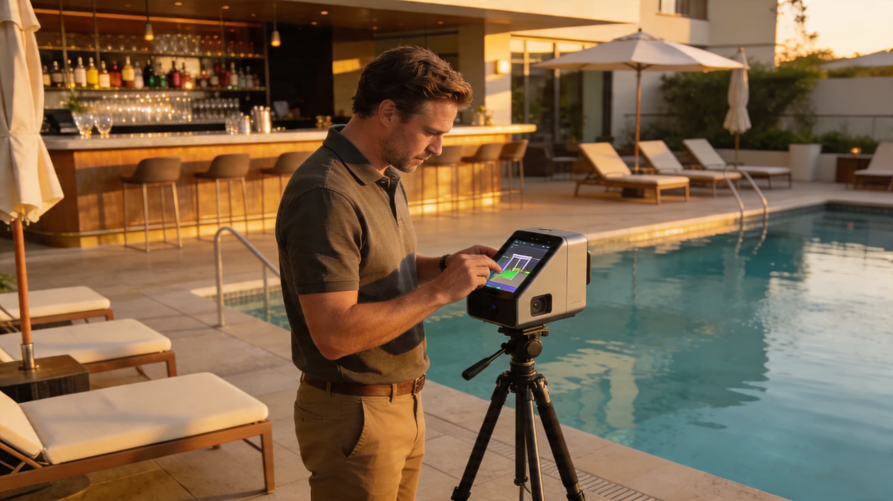
About 360VUES — Matterport 3D capture and virtual tour production. We instrument every deployment with mobile-specific Hotjar funnels for the first 90 days; the diagnoses above came directly from that data.