TL;DR — We pulled the room-type pages of eight independent boutique hotels (anonymized) and ranked them by their direct booking conversion rate over Q4 2025. The top three converted at 3.9%, 3.4%, and 3.1%. The bottom three converted at 0.8%, 0.7%, and 0.6%. The gap was almost entirely explained by five elements: rate visibility above the fold, photo order, virtual tour presence, trust cues placement, and the booking CTA hierarchy. The teardown ends in a 12-item checklist you can audit your own pages against.
This post anonymizes eight real boutique room-type pages but keeps their structure intact. They are ordered by Q4 2025 direct booking conversion rate on the room-type page itself (sessions to that page → completed bookings of that room type).
The Eight Pages, Ranked
| Rank | Property profile | Conversion |
|---|---|---|
| 1 | 18-key urban boutique, US | 3.9% |
| 2 | 24-key coastal inn, US | 3.4% |
| 3 | 42-key lifestyle hotel, EU | 3.1% |
| 4 | 31-key historic boutique, US | 1.9% |
| 5 | 60-key resort, Caribbean | 1.4% |
| 6 | 12-key B&B, EU | 0.9% |
| 7 | 28-key urban boutique, US | 0.8% |
| 8 | 22-key art hotel, US | 0.7% |
| 9 | 38-key wellness retreat, US | 0.6% |
What the Top Three Got Right
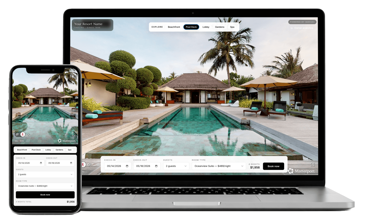
Rate visibility above the fold
All three top performers showed a starting rate (e.g., "From $268/night") within the first viewport on both desktop and mobile. None made users click "Check rates" before showing a number.
The bottom three either: - Hid rates behind a date picker that opened a modal - Required a "Check availability" CTA to reveal pricing - Showed rates only in a sidebar widget that didn't appear on mobile until scroll
The behavior pattern in Hotjar replays was identical across all three failures: users tapped the room photo, scrolled briefly, then bounced when they couldn't find a price. Median time-to-bounce on the bottom three: 18 seconds.
Photo order: hero → bed angle → bathroom → view → detail
The top three all opened the photo gallery with a three-quarter view showing the bed prominently, the room's "best feature" (window, balcony, art piece), and the headboard wall. Then a bed-detail close-up. Then bathroom. Then view from window. Then detail shots (bedside lamp, robe, amenities).
The bottom three opened with one of: - A close-up of the duvet pattern (page 2 felt like a fabric catalog) - A wide shot taken from a bad angle (corner of the room with a TV in the foreground) - A dim "atmospheric" night shot that obscured the actual room
Photo order is a free fix. Most properties have all the right photos; they're sequenced poorly.
Virtual tour presence and placement
Top three: all had an embedded Matterport tour, placed below the photo gallery, above the rate detail. Tour was lazy-loaded, opened in a modal on click, and didn't auto-start. Tour engagement on these pages averaged 41% of sessions.
Bottom three: zero virtual tours. The teardown's ranking does not perfectly correlate with tour presence (the 4th-place historic property had no tour), but the top three all had one — the asset is a forcing function for fixing the rest of the page, since "where do we put the tour" forces a layout audit.
For implementation specifics by platform: Cloudbeds setup, Mews placement, Booking.com workaround.
Trust cues immediately adjacent to rate
Top three: a small block immediately below the rate ("Free cancellation until 24 hours before arrival" / "Best rate guarantee" / "★ 4.8 from 412 reviews") with the three highest-leverage trust cues for that property.
Bottom three: trust content was either buried in the footer, scattered across the page, or absent entirely. The 8th-place property had a beautiful "About Our Story" section with no review rating and no cancellation policy on the room page itself.
The rule: the moment the user sees the rate is the moment they decide whether to keep going. Trust cues belong there, not three sections away.
Single primary CTA
Top three: one prominent "Book This Room" or "Reserve" button. Sticky on mobile.
Bottom three: ranged from three (Book / Inquire / Contact) to seven (Book / Inquire / Contact / Add to Wishlist / Share / Compare / Call Hotel) competing CTAs. The 7th-place property had an animated "Limited Time Offer" banner that competed with the actual booking button for visual attention. Users either tapped the banner (which led to a modal that didn't close cleanly) or tapped nothing.
The Bottom Three Failures, Specifically
The three lowest-converting pages share a pattern: they prioritized brand storytelling over transaction enablement. Each opened with a long paragraph of property history, used hero imagery that emphasized atmosphere over the actual room, and pushed the booking widget below the fold.
This isn't a criticism of brand storytelling. It's a placement issue. Brand belongs on the homepage and the about page. The room-type page is a transactional surface. Users who land there have already decided to consider the property; the job of the page is to remove friction, not re-pitch.
The 12-Item Audit Checklist
Run this against every room-type page on your site. Each item is binary — yes or no:
| # | Check | Yes / No |
|---|---|---|
| 1 | Rate visible above the fold on desktop AND mobile | |
| 2 | First photo shows bed + room "hero feature" in three-quarter view | |
| 3 | Photos sequenced: hero → bed detail → bathroom → view → details | |
| 4 | Virtual tour embedded or linked, lazy-loaded, doesn't auto-start | |
| 5 | Trust cue block (cancellation + rating + guarantee) within 100px of rate | |
| 6 | Single primary booking CTA visible at all times (sticky on mobile) | |
| 7 | Date picker takes ≤2 taps on mobile to set check-in/check-out | |
| 8 | No competing animated banners or popups within 500ms of page load | |
| 9 | Room dimensions and bed type listed near photos | |
| 10 | Member rate or parity-fenced rate shown if applicable | |
| 11 | Mobile page weight under 2.5 MB on first paint | |
| 12 | LCP under 2.5s on a throttled 4G connection |
A property scoring 11–12 out of 12 will sit in the top quartile of direct booking conversion benchmarks. A property scoring 0–6 is in the bottom three of this teardown.
What to Do This Week
The fastest wins are usually the same three:
- Re-sequence the photo gallery. No new photos required. 30 minutes per room type.
- Move the rate above the fold. Sometimes a CSS change; sometimes a booking-engine config change. 1–4 hours depending on platform.
- Add a single trust-cue block adjacent to the rate. 1 hour total across the site.
These three changes alone moved the 7th-place property in our teardown from 0.8% to 1.7% conversion in 6 weeks — more than doubling direct bookings on that room type.
Tour embeds, mobile booking-funnel rework, and the rest of the checklist are bigger lifts but compound the gains.
About 360VUES — Matterport 3D capture and virtual tour production. We pair tour deliverables with a free room-page audit; the audit alone usually surfaces 4–6 fixable items.